Influx Time Series
Building beautiful dashboards with InfluxDB and Telegraf.

I have always been fascinated by dashboards. I used to run a Dashing dashboard at one of my earlier jobs and the animated colorful tiles made our application that little more tangible.
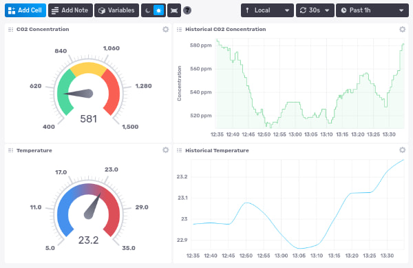
InfluxDB, an open-source time series database and dashboard. The screenshots look nice so I have been wanting to kick its tires. I already read the CO2 concentration and temperature from my cheap CO2 monitor so I combined the two in the colorful dashboard shown above.
InfluxDB is the database and dashboard part. It keeps the data in so called ‘buckets’ with a configurable retention policy and has a webUI to easily build beautiful dashboards. New metrics can be stored in InfluxDB via a HTTP API, but the default seems to be via Telegraf, a single no-dependency binary to collect, filter and send metrics to InfluxDB. The lightweight Telegraf agent is installed on the systems you want to collect metrics from.
I installed NixOS 21.11 with InfluxDB 2.0.8 on an old laptop as a quick test. Disclaimer: all the cool kids are playing with NixOS and this was my first experience with both NixOS and InfluxDB so take the following with a grain of salt.
InfluxDB
This could not have been easier. Add the ‘influxdb2’ package, enable the service and (optionally) open port 8086.
environment.systemPackages = with pkgs; [
  influxdb2
]
services.influxdb2.enable = true;
networking.firewall.allowedTCPPorts = [ 8086 ];A quick ‘nixos-rebuild switch’ and we are good to go. InfluxDB can be configured via the webUI at localhost:8086 (replace ‘localhost’ with the IP address if not on the same machine). Create a new user, organization and a first bucket to store metrics in. I have a ‘test’ bucket with a retention policy of a few days and a ‘home’ one with a longer retention to store sensor data from around the house.
Metrics can be sent to InfluxDB via the HTTP API and a token. The token can be generated via the InfluxDB webUI under the ‘Tokens’ tab in the ‘Data’ section.
curl --request POST localhost:8086/api/v2/write?org=ORG&bucket=BUCKET&precision=s \
     --header "Authorization: Token TOKEN" \
     --header "Content-Type: text/plain; charset=utf-8" \
     --header "Accept: application/json" \
     --data-binary "sensor1,location=living temperature=25,humidity=65"
Telegraf
I already had a CO2Mini meter from way back which I can read out via co2mon.
$ co2mond -D /tmp/co2mon
CntR	437
Tamb	21.1625
CntR	437
Tamb	21.1625
…
co2mon updates the CntR and Tamb files in the specified directory with the latest readings. Using the ‘exec’ Telegraf plugin we can read these values and hand them off to InfluxDB. Telegraf can read its configuration from the InfluxDB instance so all Telegraf’s agents are centrally configured, cool!
Create a new Telegraf configuration via the ‘Telegraf’ tab in the ‘Data’ section of the InfluxDB webUI.
[[outputs.influxdb_v2]]
  urls = ["http://localhost:8086"]
  token = "$INFLUX_TOKEN"
  organization = "myorg"
  bucket = "home"
[[inputs.exec]]
  commands = ["cat /tmp/co2mon/CntR"]
  name_override = "co2_concentration"
  data_format = "value"
  data_type = "integer"
[[inputs.exec]]
  commands = ["cat /tmp/co2mon/Tamb"]
  name_override = "temp"
  data_format = "value"
  data_type = "float"
On the client (the machine the CO2 monitor is connected to) I start the Telegraf agent with this remote configuration.
export INFLUX_TOKEN=TOKEN
telegraf --config http://localhost:8086/api/v2/telgrafs/097240ebe8df7215
Conclusion
The InfluxDB installation and configuration process was amazingly easy! Collecting data via the API works as expected, I can easily see how to hook this up with an existing web application. The Telegraf agent is powerful and once I understood what plugin to use, I was impressed by how easy it is to link a data source to InfluxDB. The InfluxDB webUI and color scheme are simply gorgeous, both light and dark modes.
I wish there was a way to add markers to the graphs. A horizontal line for a maximum value (dangerous levels of CO2 for example) or a horizontal one to mark events (e.g., opened a window at 12:32). Maybe combined with the alerting system that’s already included? It feels weird that critical alerts don’t show up on the dashboards.
The alerting system itself is too basic as well. Slack, Pagerduty and HTTP endpoints come out-of-the-box, but I expected more powerful features here.
Setting up new and beautiful graphs, gauges, heatmaps, etc. is easy via the webUI. I did run in some smaller bugs though (the gauge’s “optional suffix” setting for example freezes the dashboard) or adding a second moving average query to my graph would show weird extra lines. Nothing that can’t be fixed in a patch release.
I would like visualizations for a fixed timeframe. A heatmap of all days combined to name one. Showing CO2 levels are consistently higher than average around 11AM for example. I didn’t find a way to create such visualizations, only the “past x seconds/minutes/hours” ones. I am not sure if that’s currently possible.
To end: InfluxDB’s data collection and visualizations are top notch, all without having to write a single line of code! The alerting/insight part could be improved upon.